t10: take 10 packaging design and Branding
Year
2021
Role
Naming
Creative Direction
Brand Design
Packaging Design
Software
Adobe Illustrator
Autodesk Fusion 360
Challenge
Develop a beginner-friendly, buildable, yet, time-sensitive approach to skincare while putting sustainability at the forefront of the design process.
Solution
A three-step, ten-minute night-time skincare routine that represents the building blocks for any skincare routine by highlighting a double-cleansing method for happier and healthier skin.
Why Skincare?
My passion for skincare grew when I realized how much more confident and healthier I felt when I started taking good care of my skin two years ago. One of the biggest misconceptions about skincare is how time-consuming and complicated it can be. Based on my own experiences and further research, I learned less is more. Therefore, I wanted to build T10 or Take 10 around the simple idea of building blocks. T10 equips consumers with the foundation for an efficient buildable skincare routine in 3 easy steps.
brainstorm sketches
Name
I wanted a name that was short and could be easy to pronounce. Out of all my options below, T10: Take 10 seemed to be the one that made the most sense for this particular brand.
Forms
After researching and talking to other skincare enthusiasts, I concluded a double cleansing system is crucial in a skincare routine whether you wear makeup or not. I wanted to emphasize the importance of double-cleansing in this beginner-friendly brand. This led me to create a three step-routine that includes: one oil cleanser, one water-based cleanser, and one moisturizer.
Packaging
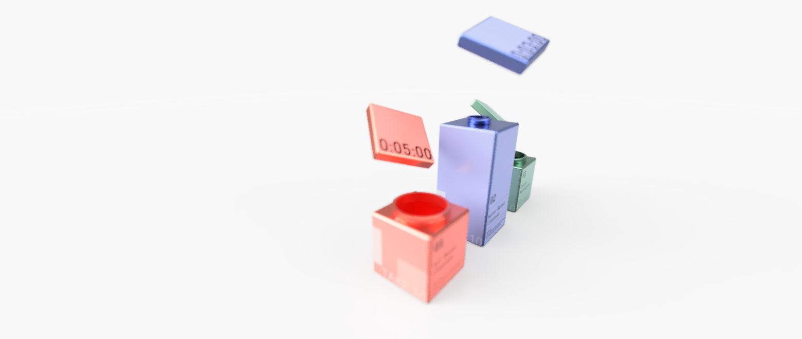
I started by researching different sustainable kinds of bottles brands uses in their skincare lines. Some of the most popular was an airless pumping system and refillable containers. However, most of these options used plastic in one way or another. I quickly learned the benefits of bamboo and aluminum as sustainable alternatives. However, I ultimately decided to go with aluminum since it is more affordable than bamboo packaging.
I decided to go with blocks for the final packaging since it reflected the idea of building blocks and allowed the consumer to get the most product based on my research.
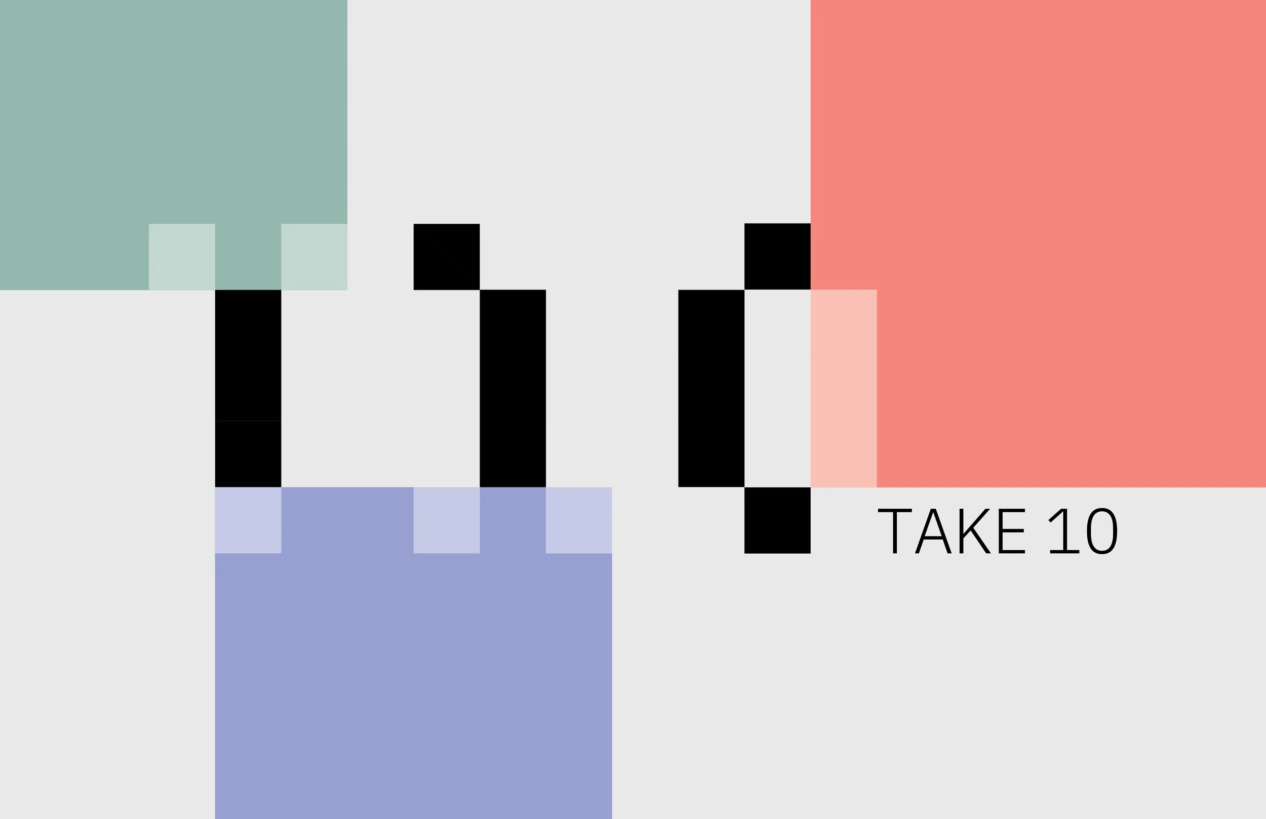
I started brainstorming the logo with building blocks. Some ideas were using different-sized blocks to create a bolder look. However, considering my original idea, I didn’t want the feel of the brand to be too overwhelming since it is a beginner-friendly brand. So, I started using these blocks more literally by using squares to create the logo.
For the final logo I decided to bring in the letters “Take 10” in IBM Plex Mono, a modern san-serif font, to balance the abstraction of the blocks.
Packaging
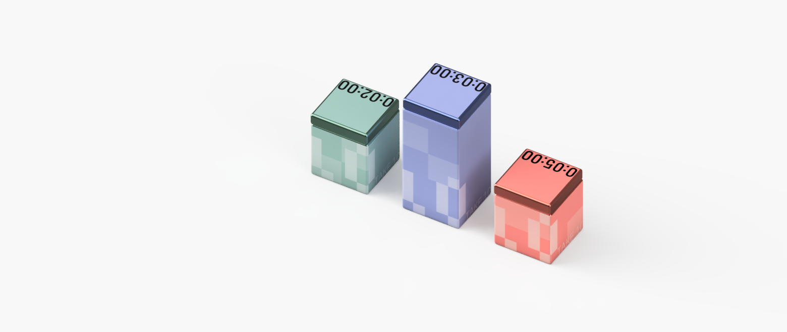
T10 packaging makes it easier to take out and put away your skincare bottles with a “block” design. When not in use, you can stack the blocks on top of one another to create more space.
Color
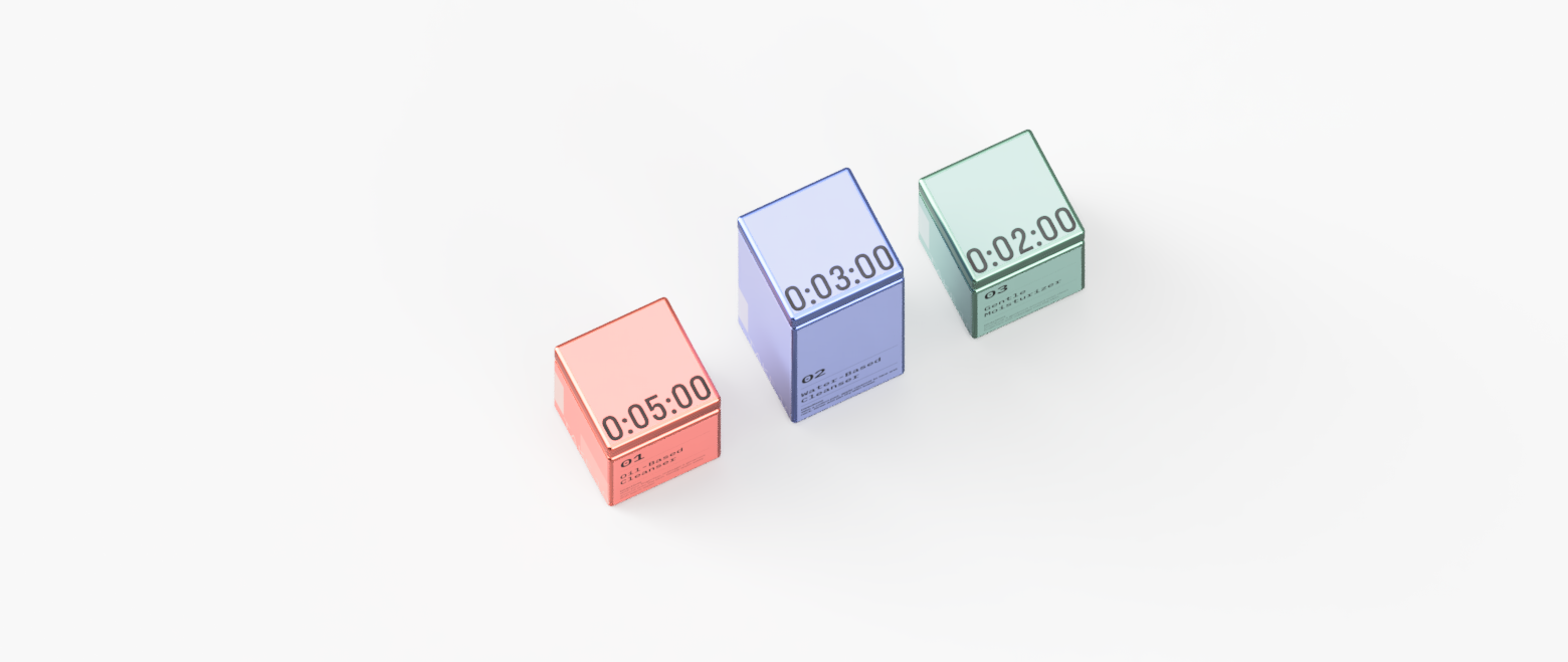
The three primary colors, Sunset Orange, Reflection Blue, and Peaceful Green represent each step in the 3-step skincare routine. The muted colors reflect the relaxing, sophisticated, and gender-neutral approach to the brand.
Time
On the lid of each bottle, there is a time indicating an estimated time this particular step in the 3-step routine should take. The 3-step routine is intended to take around 10 minutes. The number of squares on each bottle is also another reference to the timing of each step.


