Kansthalle basel kunstkredit 76-77 poster design
Year
2021
Role
Art Direction
Photography
Image Making
Software
Adobe Illustrator
Adobe Photoshop
Adobe Lightroom
Challenge
Study an assigned poster and explore different tactics to create a cover poster.
Outcome
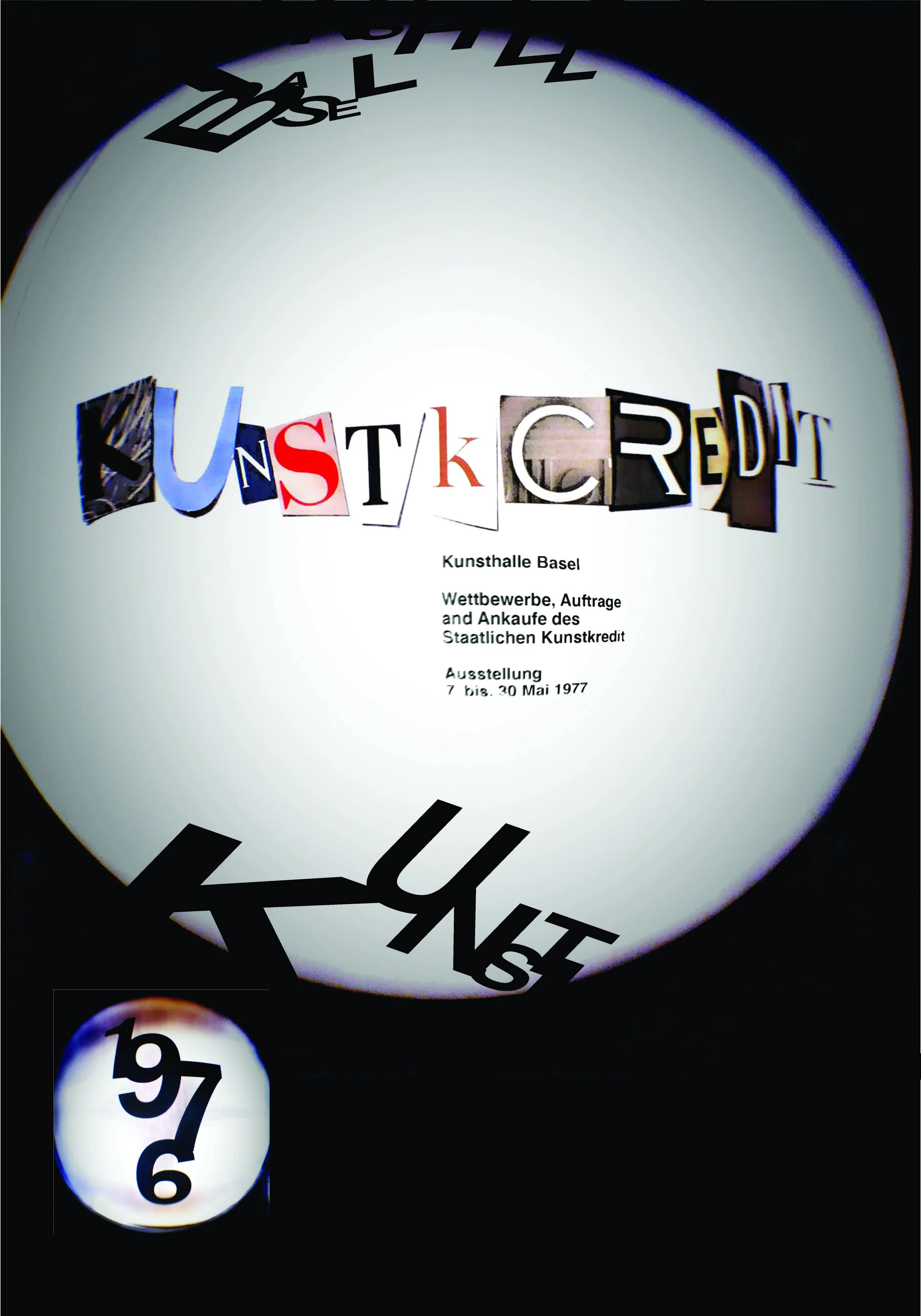
A cover poster that translates Wolfgang Weingart’s Kansthalle Basel Kunstkredit 76-77 exhibition poster from black and white to full color. Poster dimensions: 50 3/8 in. x 35 in.
Brainstorming
The process consisted of various iterations exploring mediums, color, and hierarchy. The following images each represent the tactics used: perspective, mixed media, vector illustration, and color.
I started by brain-dumping all of my thoughts on different artboards in illustrator. One of the reasons I love the original poster so much is because of the architecture in the composition. The first thought I was how I could re-do the architecture using type. These are explorations of this thought.
TACTICS
The next part of the process was narrowing down my tactics to cover the original poster. This consisted of various iterations exploring mediums, color, and hierarchy. The following images represent the tactics used: perspective, mixed media, vector illustration, and color.
Tactic 1 Perspective
How would the poster be different from the perspective of the camera in the original poster? This exploration involves taking a photo with a fish eye lens camera to capture the magazine clippings recreating the type in the original poster.
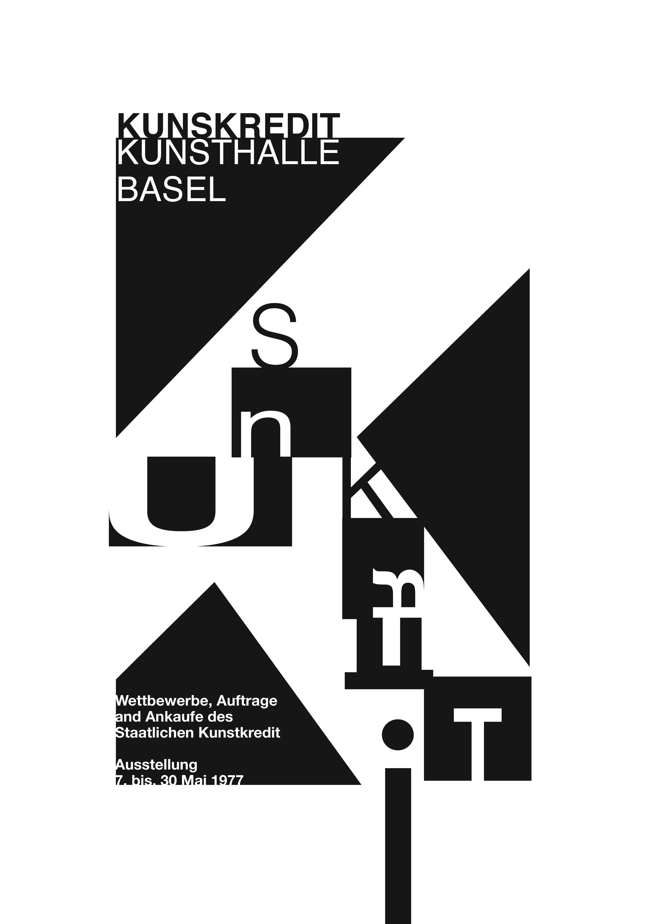
Tactic 3 Vector Illustration
Using only type, how can this poster reflect the shapes and hierarchy in the original poster? This is an exploration of using different letters and stretching some to reflect how type was manipulated in dadaism and futurism.
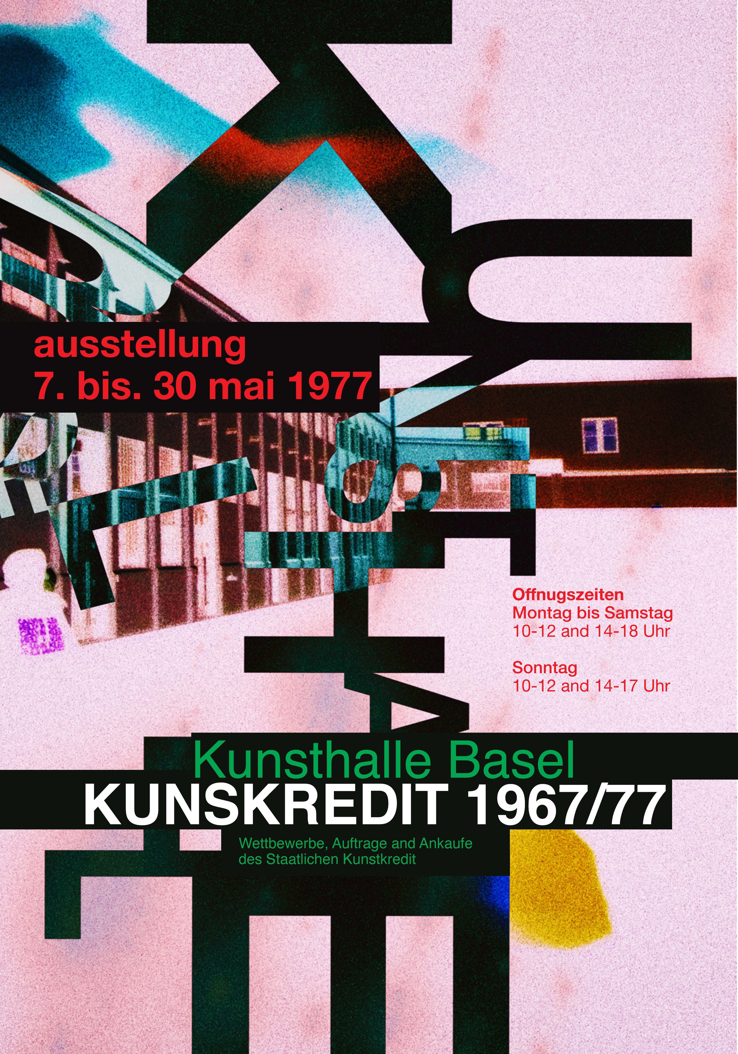
Tactic 2 Mixed Media
The second tactic was created using magazine clippings and layering the Aktiv Grotesk typeface on top. Then, the piece was scanned to give the poster more textures similar to those found in the original poster.
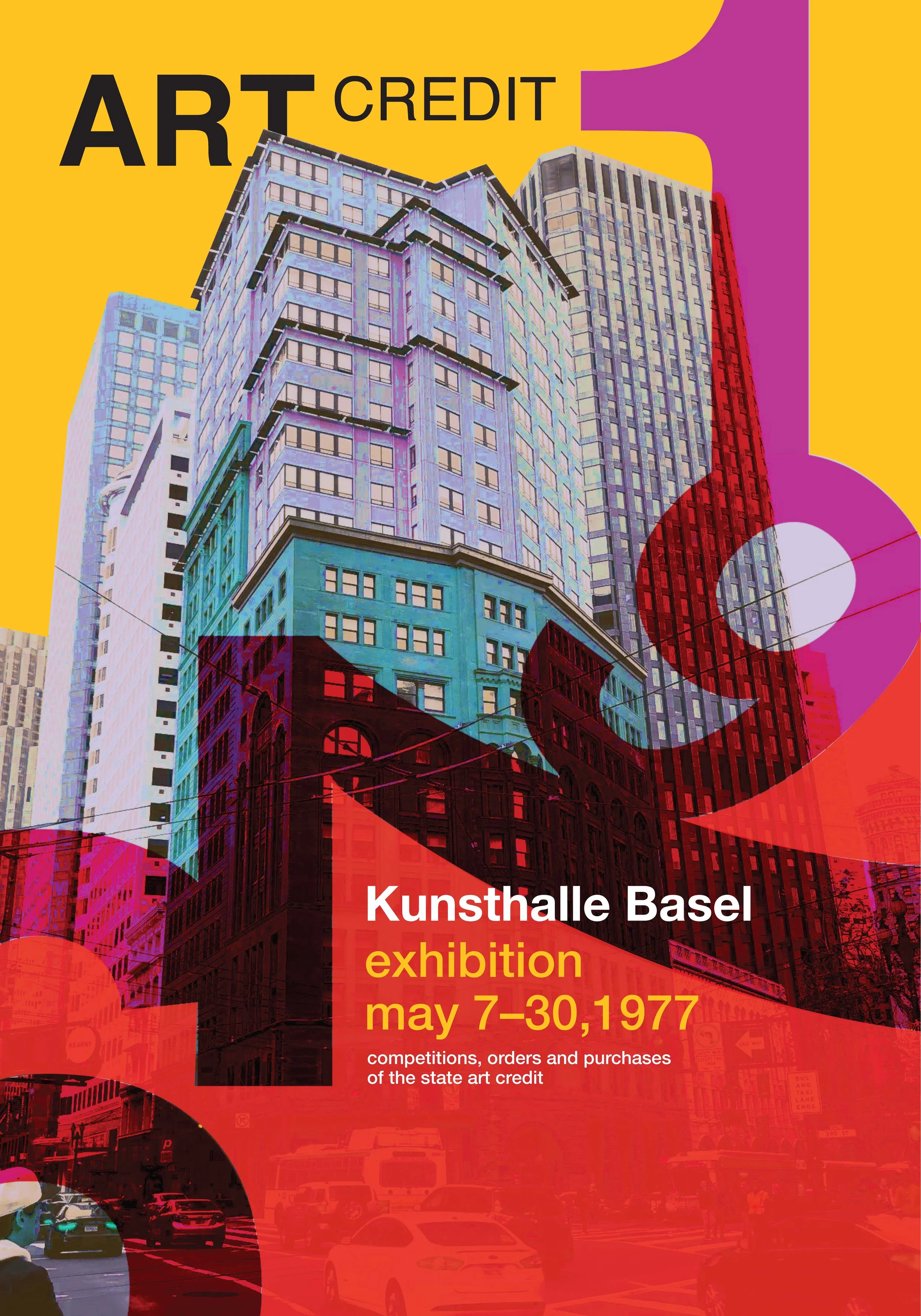
Tactic 4 Color
How would the poster be different if it was all color? Here is a depiction of that exploration using some of the most colorful hues and tones.
Outcome
Tactic 4 (color) was chosen as the final approach because I wanted to allow viewers to experience this poster in full color. Using unlikely color pairings in combination with different type size embraces the unconventional decisions made in this new art style created by Weingart. Based on the architecture on the original poster, I decided to continue the trend and add a few buildings and a gradient as the sky. Finally, integrating the start year of the exhibition poster in a way that echoes the scale of design elements in the original poster.
The original poster was written in German. Therefore, adding an English translation to my cover poster opened up a new audience and gave viewers a way to understand and hopefully want to learn more about what kind of exhibition it may be.
original poster
cover poster